
Bona Web Refresh
Bona is a global, sustainably-driven company that supplies products for installing, renovating, maintaining and restoring premium floors. A small team of designers including myself were tasked to redesign their site to encompass a more successful user experience journey for users, that was easy to follow and aesthetically pleasing while adhering to Bona's brand.


Strategy & Goals
Our main goal was to take a look at current issues that customers were facing and discuss strategies to improve their experience on the site. Bona wanted users to feel comfortable finding and searching for products, driving up unique visits as well as return visits. We already had the bones of the website to work with, but we needed to conclude how to make the update polished, professional, and more user friendly. Our strategy for this task was to research successful competitor sites, speak to current customers, and test the old site to find any problematic components.
Research
While testing out the old site, we found a multitude of issues including a complicated navigation bar, extension drop down menus and a poor portrayal of product lists. We also found that the articles landing page was too extensive, and we wanted to refresh it in a way to bring in highlighted articles that were easy to read. Customers reported that they had difficulty finding specific products and searching for local products near them. We found that the site was too cluttered, and wanted to simplify it so customers could easily find what they were looking for. Competitor sites showed that simple and fresh components offered a better user experience all around.
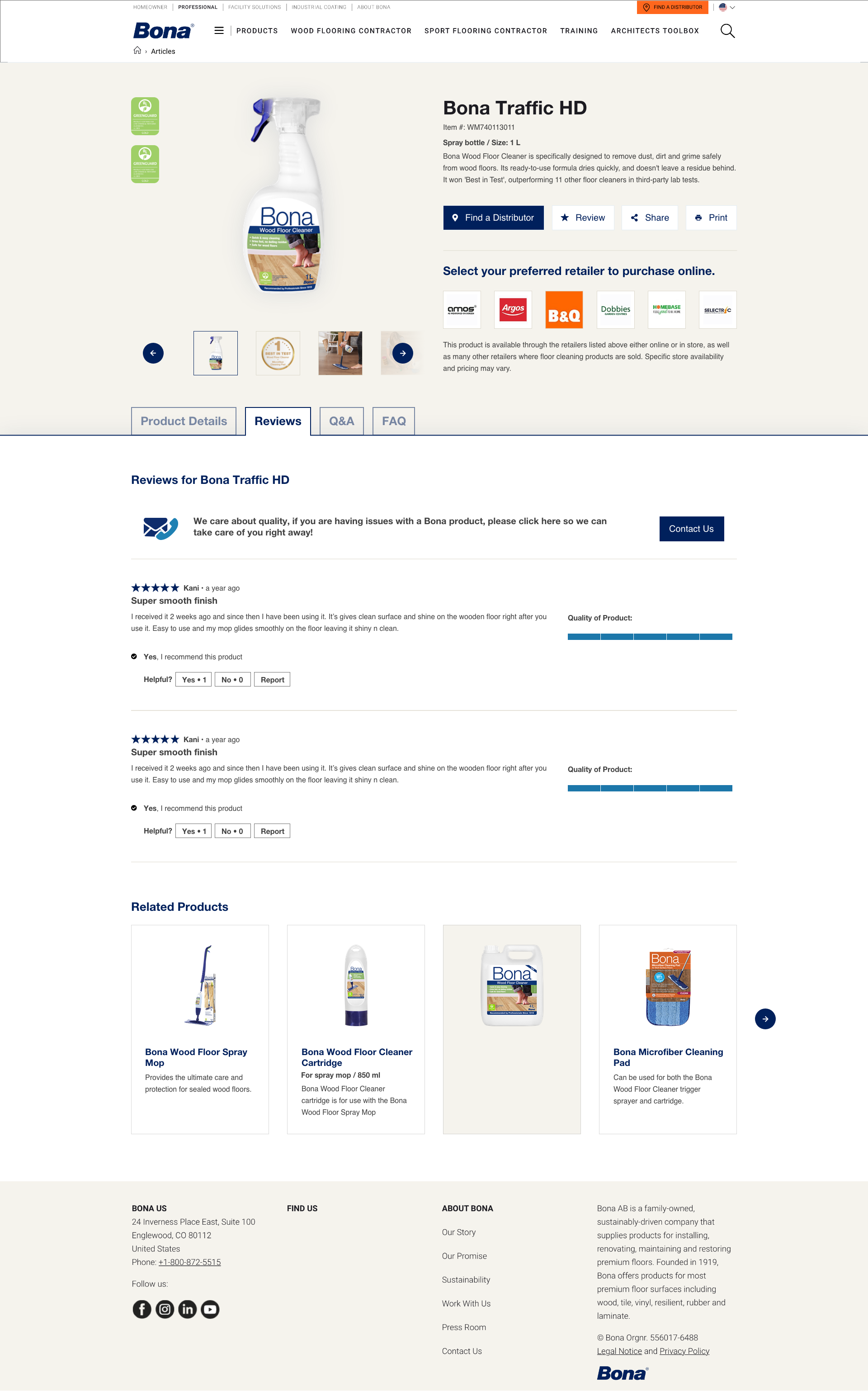
Design
My main task was to create a homepage, article landing page, article page, products page, product detail page, and locater page for customers to find where Bona products are sold near them. We also added a "Join the Club" newsletter sign up page to target customers to join our monthly e-Newsletter club to continue to drive engagement. We aimed for warm, friendly, and inviting imagery as well as more professional and crisp product photos. We also left more room for white space, allowing the content to speak for itself instead of feeling cluttered and overwhelming. A simplified navigation bar with a search button offered users an easy way to find exactly what they needed.